SEARCH FINESCALE.COM

Enter keywords or a search phrase below:

Revell 1:83 Mayflower

50175 views
601 replies
1 rating 2 rating 3 rating 4 rating 5 rating
  • Member since
    July 2014
  • From: Franklin Wi
Posted by Bakster on Tuesday, June 14, 2016 7:19 PM

Say GM, thanks for sharing images of your Potemkin. I see what you mean with the color variations. Very nice work sir. You guys have set me on a good path. I am looking forward to getting started!

  • Member since
    July 2014
  • From: Franklin Wi
Posted by Bakster on Tuesday, June 14, 2016 7:31 PM

Bill, this is good to know. Thanks for sharing this...

  • Member since
    July 2014
  • From: Franklin Wi
Posted by Bakster on Sunday, June 19, 2016 5:39 PM

I have made some progress today with trying to get a old wood look. It looks pretty close to that old dock look that GM was talking about. I still have some kinks to work out in the procedure but I feel good about getting this far. Up until now it was a series of dead ends. So, an important breakthrough has been made. 

Hopefully soon I will nail this down and then I can post what I have come up with.

To be continued...

  • Member since
    July 2014
  • From: Franklin Wi
Posted by Bakster on Tuesday, June 21, 2016 10:12 PM

Hi guys...  Here is where I am so far.  I am pretty close to getting the old wood look to where I want it. I did this by applying a wash to a base coat of white paint. You can see that I missed a spot near the grating.

Overall I am happy with the look. Next I will strip all this and try again. This next time I will try adding the color variations that GM and JT were talking about, and then apply the wash. Though I really like the current look, it might be too weathered. It looks good under magnification but I think it gets lost in translation under normal magnification. Adding some color should help that I think. 

Your thoughts and comments are welcome.


  • Member since
    September 2012
Posted by GMorrison on Tuesday, June 21, 2016 10:16 PM

That looks really good. It's a base. Don't strip it.

Now get some darker thin wash going and flood the grates.

This is top notch work. In a completed model with all the rest going on around it, it will be the correct backdrop for the details you add.

I would not bother to pick out the planks, I like it as a sort of base for the items with more color you'll be adding.

Good work, Steve.

 Modeling is an excuse to buy books.


  • Member since
    July 2014
  • From: Franklin Wi
Posted by Bakster on Tuesday, June 21, 2016 10:24 PM

So you recommend that I use a darker gray to flood the grates.  My initial thought was that maybe I should paint the grating a weathered brown or black. I often see model ships with them a different color than the deck. I really appreciate and respect your opinion. And thanks for the kind words.

  • Member since
    July 2014
  • From: Franklin Wi
Posted by Bakster on Wednesday, June 22, 2016 9:30 PM

Master Morrison--is this what you had in mind? I am on the fence if I went too dark. It is too early to tell because the wash is still a bit wet when I took this photo.


  • Member since
    September 2012
Posted by GMorrison on Wednesday, June 22, 2016 9:39 PM

That is the real deal, and no I'm no longer a Master, more like a Mate.

You are doing good things here.

That's the way to do it. Now you have a plausible base on which to build up detail, and it will never look like a toy.

 Modeling is an excuse to buy books.


  • Member since
    July 2014
  • From: Franklin Wi
Posted by Bakster on Wednesday, June 22, 2016 10:19 PM

Thank you sir. But even beginners get lucky sometimes, and more importantly, I have good teachers helping me out! Confused 

That my friend, is a work of art. I love what you did with that Viking ship. That is a serious piece of art.

  • Member since
    September 2012
Posted by GMorrison on Thursday, June 23, 2016 12:45 AM

Our goal is to get your ship there. It won't be hard, and you have the desire.

Remember, it's easier to add detail than erase mistakes.

I spend a lot of time down around the water because I raise and walk Laborador Retrievers and I like it there. I'm blessed to live in a beach town, and I like to sail.

All in all, ship models should look like sunlight, which is the great equalizer.

 Modeling is an excuse to buy books.


  • Member since
    July 2014
  • From: Franklin Wi
Posted by Bakster on Thursday, June 23, 2016 9:10 AM

"Our goal is to get your ship there. It won't be hard, and you have the desire."It humbles me seeing everyones desire to help. And you my friend, have a servants heart. I have said this before... You are a good man Charlie Brown. 

"Remember, it's easier to add detail than erase mistakes." I absolutely agree. This is why my project snails along. I am trying to avoid that trap, and when trying new things, it's full of traps. The biggest enemy that I have is my overwhelming desire to rush through something. That's when mistakes happen. It's a constant battle to stop and say, NO! 

"I spend a lot of time down around the water because I raise and walk Laborador Retrievers and I like it there. I'm blessed to live in a beach town, and I like to sail." Very blessed indeed!

"All in all, ship models should look like sunlight, which is the great equalizer." I like the sound of that but I'll have to think about that one. IdeaBang Head

By the way. I will do a post in a few days showing how I did the deck weathering. I think you guys will be amazed at the simplicity of it. There is a bit of wizardry with regard to the mixtures, but the process is very simple.


  • Member since
    May 2003
  • From: Greenville, NC
Posted by jtilley on Thursday, June 23, 2016 5:15 PM

Your first coat on the decks looks great. If I were you I'd dry-brush a very light shade of beige, or tan, to highlight the wood grain and give the overall deck a slightly more woody look. To my eye, the planking now looks pure grey - though the camera and my monitor may have something to do with that.

The gratings actually have holes in them - right? A real grating, along with its coaming, probably would be varnished, and the coaming probably would have been made of oak, rather than the pine of the deck planking. My inclination would be to make the coaming a slightly darker color, maybe with a semi-gloss coat on it.

Good luck.


Youth, talent, hard work, and enthusiasm are no match for old age and treachery.

  • Member since
    July 2014
  • From: Franklin Wi
Posted by Bakster on Thursday, June 23, 2016 9:23 PM

No sir. There is nothing wrong with your eye or monitor. It IS pure gray with tonal variations. I think that we were envisioning a severely weathered deck that has lost its color.

Coaming...that is a new term for me. Had to look it up. 

I will review this.


  • Member since
    July 2014
  • From: Franklin Wi
Posted by Bakster on Thursday, June 23, 2016 9:27 PM

Added tonal variations to my last post.

  • Member since
    July 2014
  • From: Franklin Wi
Posted by Bakster on Saturday, June 25, 2016 9:39 AM

Old Wood


Before I had started this build I did some searches on weathering plastic. At that time I had stumbled on an obscure, but a really great reference. It was a keeper, and I stored the link. I had completely forgotten about the link though when I started researching this again. What is crazy is that this reference didn't come up in the subsequent searches that I did. The short of it is that I found the link, studied the simple process, and then I set out to see if I could make it work.

Here is the link. To save myself some typing about the process, take a look at it, and if interested come back to this post for more info.

http://www.pacificcoastairlinerr.com/rough_weathered_plastic/

Continued

I followed their instructions with one exception. The writer recommends sanding the plastic to provide something for the wash to grab onto. Their example was with using a sheet of plastic deck that is much larger in scale than my deck pieces. The detail on mine is very small in comparison, and I did not want to risk damaging it by sanding.

The Journey

1. At first I tried using Gull Gray as the base coat. It's what I had on hand and it's fairly light in color. No matter how much that I thinned the wash the end result came out too dark.

2. I moved to a flat white base as the article suggests using. Now we are getting somewhere. It took some practice diluting the wash but I was starting to dial in the correct color depth. I used water to thin the dye as per the article. However, the wash was not behaving well for me. The wash pooled up and this made it very difficult to brush on without leaving brush marks, and/or, bare spots.

3. Next I tried using acrylic paint leveler in place of the water. What do you know, that helped a lot. The dye seemed to disperse and settle better. I am getting there, but I still couldn't quite get the look that I wanted. To my eye, the end result was still not believable. At this point, I had come to the conclusion that I am hitting a wall because I hadn't sanded the plastic. In the end, I think that is the probable stumbling block.

4. What now? The only thing that I can think of to try is adding other paint thinners to the mix. It seemed like a long shot, but crazier things have happened. I tested adding both Tamiya and Aztek acrylic paint thinners. Not surprisingly, I didn't see much of a difference.  

5. I am about to throw in the towel when I look to the back of my bench and I see a big bottle of IPA. I thought, what the heck, I might as well try it. So I do. I mix up a small batch, brush it on, and I watch to see what happens. Seriously, this was a eureka moment. As the wash dries it all begins to lay out perfectly. I think that what is happening is that the IPA is softening the underlying paint layer, and that this is allowing the dye to attach itself better. The final quirk in all of this is that for some reason, the IPA causes the finish to appear bone dry, mimicking old wood. Combining IPA with the paint leveler was the little miracle that I was looking for to pull it all together. The beauty of it is that it negates the need to sand the plastic, in my opinion.

There you have it.

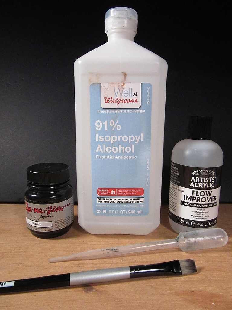
What you need is shown below. The mixing proportions is still a bit sketchy, but I can tell you this much. I used two drops of dye that I drip off of a mixing stick, about 1/3 a pipette of paint leveler, and about 1 pipette of IPA. I use a wide flat brush for application because you get more coverage quicker. I dip it into the solution and then wick off a little on a paper towel by dabbing it once.

(Note: Applying too heavy a flow can start to work against you. I had seen peculiar things happen. This is particularly true if you create too large a pool in any given area)

Flow it on and try to even it out some. Try not to re-work the same area for too long. Smooth it out some and move on. If you have to work on a certain area do it quick. You have a limited time to work things out because once that it all starts to set, it will smear if you keep working it. Along with that, the IPA softens the underlying paint. If you work an area over and over you will start to remove the paint. In either case, the work becomes toast, and then it becomes a do-over.

You will need to experiment. It is amazingly easy once you get the right mixing proportions figured out. You just flow it on and the solution does all the work. All the nice nuances magically appear.

So, that's the deal.


I decided to continue testing. I will strip the current work, reapply the white base, dry brush some color, and then reapply the wash. Lets see where that takes me. I really do like the all gray look that I have now. However, as long as that I am at a stage that I can still experiment, why not try. I will update as I progress.

One last thing. The same website offers a lot of other nice tips. It is geared to Model Railroading but much of it can cross over to things like dioramas and such. It's good stuff. Links are below.

http://www.pacificcoastairlinerr.com/weathered_wood/

http://www.pacificcoastairlinerr.com/4x8/


  • Member since
    May 2013
  • From: Indiana, USA
Posted by Greg on Saturday, June 25, 2016 11:17 AM

This is quite an adventure you have going on, Steve.

Keep plugging away, impressive progress.

  • Member since
    July 2014
  • From: Franklin Wi
Posted by Bakster on Saturday, June 25, 2016 12:07 PM

Hey Greg, thank you sir. You are right about one thing for sure. It IS an adventure. When I finally finish this project I should throw a party.  Cake And you are all invited for having to put up with me. 

I was thinking about you when I posted the links. I know that model railroading is an interest to you. There are a lot of great tips on the links provided.

Well, I am off to Hobby Town to look at a Trawler. 

  • Member since
    July 2014
  • From: Franklin Wi
Posted by Bakster on Tuesday, June 28, 2016 9:55 PM

Greetings all.  Well, more experimenting done.

1. My first experiment was with adding some color to various planks, and then applying the dye wash over it. That turned out to be a visual nightmare. The primary mistake that I made was that I didn't apply the color in a translucent enough layer. It looked like garbage.

2. Feeling somewhat defeated, I still had another clean test piece to work with. I threw the dice on a whim and I decided to make a wash out of brown acrylic paint. The wash consisted of paint, IPA, and Flo Improver. I made the color wash very thin, the lesson learned from step 1. I applied the wash and let that dry a spell. Then I applied the dye wash over it with the hope that it will visually combine the layers below the dye.

Below is a comparison of todays work verses my previous test. Just an FYI. This image does not do it justice really. It looks better than this, even the sloppy work on the coaming and such looks better. My camera struggled to capture this.

Still experimenting, I am not sweating some of the details too much yet. Next time I will use a flat brown for the coaming. The gloss that I used for this test looks like garbage. I will also have to weather it some to balance it with the weathered deck.

As far as the decking, I do like the look. Adding that thin layer of color does give it a more balanced look. More importantly, it looks pretty convincing to me under various lighting conditions. With the grayer version I struggled at times to convince myself that it is supposed to be wood. There was no problem doing that under magnification and bright light, but once you get it outside of those ideal conditions, it was a struggle.

Thoughts?


  • Member since
    September 2012
Posted by GMorrison on Wednesday, June 29, 2016 1:00 AM

#2

 Modeling is an excuse to buy books.


  • Member since
    December 2015
  • From: providence ,r.i.
Posted by templar1099 on Wednesday, June 29, 2016 4:42 AM

I magnified the pics on PB and I like the deck on top ( minus the gloss) for a working vessel, and the bottom deck lends itself to a distressed look. Personally marvel at the amount of testing and experimenting you've done. 

"le plaisir delicieux et toujours nouveau d'une occupation inutile"

  • Member since
    July 2013
Posted by steve5 on Wednesday, June 29, 2016 4:53 AM

the bottom pic , at the moment , does it for me too steve .


  • Member since
    July 2014
  • From: Franklin Wi
Posted by Bakster on Wednesday, June 29, 2016 10:30 AM

I love the feedback guys. Thank you! 

Last night after posting the image I went back and looked at the actual part. What a difference from how the photo looks. The colors don't even look right in the photo. Tonight I will pull out my DSLR and see if I can get a better image that I can post. Then I'd like you guys to relook at it and see what you think. Honestly, I can't believe how poorly the camera translated the information. It's not even close. Hopefully I can get a better image.

Thanks guys!


  • Member since
    July 2014
  • From: Franklin Wi
Posted by Bakster on Wednesday, June 29, 2016 10:42 AM

Templar, all the testing is because I know what I want, but I don't know how to get there. I am too new at this. Once I get the decks dialed in and done, then I have the hull to deal with. That will be more testing too. It will be a weathered look as well. It's a frustrating process at times but it should be worth it. Hopefully... Thanks!

  • Member since
    May 2003
  • From: Greenville, NC
Posted by jtilley on Wednesday, June 29, 2016 11:36 AM

AsI think I may have said earlier, Vallejo new offers a boxed set of acrylics for representing old wood. (I ordered a set a long time ago; I only got the message that it had been shipped today. I'm looking forward to getting it.) Here's a link:http://www.squadron.com/Vallejo-Old-and-New-Weathered-Wood-Effects-Set-p/vj71187.htm .

To my eye that picture of the flat car on the box is just about what a weathered wood deck ought to look like.

Steve, the intensity with which you're approaching this project is really impressive. But are you sure you really want to pour so much effort and time into your first sailing ship model? There's nothing wrong with acknowledging that your next model's going to be better. Remember that you don't have control over this. Your next model WILL be better than the last one - whether you want it to be or not.


Youth, talent, hard work, and enthusiasm are no match for old age and treachery.

  • Member since
    July 2014
  • From: Franklin Wi
Posted by Bakster on Wednesday, June 29, 2016 5:14 PM

Greetings John. You had mentioned the Vallejo kit but it never hurts to mention things again. I am sure there is a learning curve for their process too, and I feel that I am almost there with the current process. It would mean starting over. I will consider the Vallejo kit if this goes sideways. PLEASE let us know how it works for you though. I think many of us would be interested. I know that I am.

"But are you sure you really want to pour so much effort and time into your first sailing ship model?

Actually, I am VERY sure. All the struggles with processes now, are processes that will have to be learned sooner or later. For me, this is not just about the build, this is about learning. Why not learn them now, even if it takes longer to get through the build. Though at times it's frustrating, it's the quickest way to learn. Second to that, I have a goal for this build and I won't reach that goal it if I don't keep banging away at it. So if you are concerned, please don't be. I appreciate your concern though. Smile 


Thanks!


Steve


  • Member since
    December 2012
Posted by rwiederrich on Wednesday, June 29, 2016 7:03 PM

Glad you have seen the light....Idea

For years I ha ve used black/brown/red/yellow India inks deluted in Isopropal alcohol.

I use a spray bottle or misting bottle to apply the colution.  For light weathering I add a single drop of ink to 8oz of alcohol.  Perfect evey time.....

You can weather any material....plastic..wood...paper...

Good job!

Rob

  • Member since
    July 2014
  • From: Franklin Wi
Posted by Bakster on Wednesday, June 29, 2016 7:57 PM

Say Rob, thanks for chiming in! It's good to know that I am on a good path with this, IPA and all...  I would love to see some of your work.

THAT is a great tip to use a spray bottle! Dang it! I wish I had thought of that. I am going to try that. That should eliminate issues of brush marks.

Thanks Rob! 

  • Member since
    July 2014
  • From: Franklin Wi
Posted by Bakster on Wednesday, June 29, 2016 9:27 PM

Ok guys. Here is a new photo. This is much much closer to how the piece looks to the human eye.

It is shocking at how poorly cameras are able to capture subtle detail. Even my full frame DSLR failed the test. I had to do something called HDR photography in order to capture the tonal range as shown in this image. This is a process of taking three images of the same object at various exposures. In my case...I took one image at the correct exposure, one was taken two stops below, and one was taken two stops above. Then the three images are run through special software where the three images are combined, extracting hopefully, all the good data from each exposure. This image does have a slight reddish cast to it, and maybe it is a little more color saturated than it should be, but it is very close to how the piece looks.

Take a look. I left it as a somewhat larger file so that you can open it up in PB for closer examination.  

  • Member since
    September 2012
Posted by GMorrison on Wednesday, June 29, 2016 9:45 PM

Excellent!

 Modeling is an excuse to buy books.


  • Member since
    December 2012
Posted by rwiederrich on Thursday, June 30, 2016 1:54 AM

Yep..there you go.  Now I'm not sure if the acrylic paint within the alcohol matrix will have issues seporating and or drying stangly......but if it works..Bow Down

I won a contest some years ago using alcohol/India ink washes for my decks and boy oh boy.  However, I didn't mix paint in with the solution....I simply painted the decks a simple light color...added accent colors to denote seporate planks, paint gradings and hatchways and the such....then I sprayed on the India ink/alcohol solution and let the magic happen.  It evaporates quite quickly leaving a nice effect in short order.

Makes the deck/items grain and detail pop...plus it nicely weathers the work...not leaving the model looking all too new.  The sea's a tough place on wood and iron/copper hardware.

Looks magnificent.

Rob

JOIN OUR COMMUNITY!

Our community is FREE to join. To participate you must either login or register for an account.

SEARCH FORUMS
FREE NEWSLETTER
By signing up you may also receive reader surveys and occasional special offers. We do not sell, rent or trade our email lists. View our Privacy Policy.