Back again from a long hiatus. That's how it goes. =/
I recognized there were a couple of features I left out which are kind of incidental but I still wanted to acknowledge them as I feel it's a small thing that can lead to bigger thinking and I want to pay it forward always. That's the point of a Work In Progress.
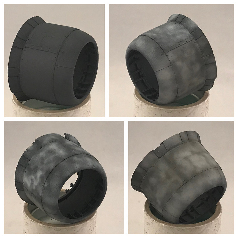
When working out of black basing for a paint scheme, I believe it can be advantageous to use very dark colors that are not literally black. What we're trying to achieve is a contrast between light and dark colors so as to add some depth at what is occurring on the surface of the paint (i.e. joints, weathering, dirt, grime, oil slick, etc). Painting in black on a canvas for a landscape or what-have-you largely just isn't done. A darker shade of a particular color might be used but not literally black. A shaded grassy scene in the park will certainly have lighter and darker greens that may get warm with yellows or cooler with blues, but often not darkened so heavily with black. I'm bringing that same mindset over to modeling with black basing. The blue-grey scheme on top has a Sea Blue color which is very dark and will contrast very well with the lighter blues represented annnnd will also share some blue components to tie it together a little better. The same is going on for the bottom of this Corsair. A very Dark Grey is applied to the bottom. Together these colors give some separation from a cooler impression to the top coat and a warmer impression to the bottom. Unfortunately, I failed to get a picture of this transition. Here is the best I could find.
 Untitled by Britt Vallot, on Flickr
If you follow along the middle of the fuselage, you can make out the transition of the darker colors. Big takeaway here is having a dark enough color to make the contrast between the light and dark colors in the scheme. Darker paint schemes present a different challange that I can discuss in another post.
[edit: I did find one example I can share. You'll note here on the cowling where this is represented well. The darker Sea Blue on top and the Dark Grey below is a subtle difference but enough to help push our different color schemes in the right direction.]
 2021-02-21 16:31:33 by Britt Vallot, on Flickr
Paint 2.0
Finally getting to the fun stuff where all that hard work comes to life. I start from the bottom up where I can blend top/bottom colors without ugly transitions. The blend coat is put down in thin coats so as not to lose the the subtly of what's underneath. I mixed up an batch of ANA 602 Sky Gray with amazingly an almost 1:1 ratio of Tamiya Flat Black and Flat White.
 Untitled by Britt Vallot, on Flickr
Surprised how easy it was to get that gray without more troubleshooting. A brief comment on that though. When mixing paints like this, start with your light color and add a bit of the darker color to it even when you have a ratio in mind. Darker pigments tend to take over more quickly. =]
 Untitled by Britt Vallot, on Flickr
Very happy with the results. The top coat required a bit more focus as I have a few spots where different weathering patterns are occurring. I'll elaborate a little as I go, but if anyone wants to hear more about a certain area just speak up in the thread. To maintain control throughout the painting of the top USN Blue-grey (FS 35189) I'm using Tamiya XF82 which is practically dead on for Blue-grey. This way when I need to go a little lighter or darker due to fading/weathering...I'm working from the same base color. Normally, with all the mixing I do at different intervals it can be hard to consistently mix the exact same color when needed. XF82 is a winner! Light coats blend this marbling nicely.
 Untitled by Britt Vallot, on Flickr
 Untitled by Britt Vallot, on Flickr
 Untitled by Britt Vallot, on Flickr
 Untitled by Britt Vallot, on Flickr
 Untitled by Britt Vallot, on Flickr
 Untitled by Britt Vallot, on Flickr
 Untitled by Britt Vallot, on Flickr
 Untitled by Britt Vallot, on Flickr
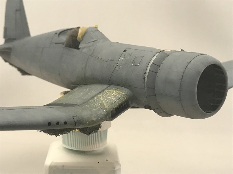
Turning my attention to the cowl. This engine cowl got beefed up with the Vector set and a few addtions with some scratchbuilding to help bring it together. This part sort of speaks for itself.
 Untitled by Britt Vallot, on Flickr
 Untitled by Britt Vallot, on Flickr
 Untitled by Britt Vallot, on Flickr
 Untitled by Britt Vallot, on Flickr
 Untitled by Britt Vallot, on Flickr
Under the weather
How timely right? No apologies for the dad jokes.
Here I'm using the hairspray method which works beautifully no matter what the scheme. With this top coat of Blue-grey on, I load up a brush of water and make passes over the top of the wing here to soften the paint. I use a toothpick to slowly remove the paint along rivets and panel lines in a pattern that is commonly seen among Pacific Corsairs. A toothpick can be more discriminating than a small brush or another such tool and won't scratch up the surface. If you recall, I already had some of this worked out with the zinc chromate and aluminium skin. So really I just need to reveal it. On the starboard side I ran into a bit of trouble that I'm blaming on the hairspray. Get the cheap stuff. Cheaper the better! I managed to save it though by adding back some aluminum with a watercolor pencil and sponged in the zinc chromate where I needed it. Voila, crisis averted.....and here's the rest of that.
 Untitled by Britt Vallot, on Flickr
 Untitled by Britt Vallot, on Flickr
 Untitled by Britt Vallot, on Flickr
 Untitled by Britt Vallot, on Flickr
I kept this moderate as the picture of Kenneth Walsh's White 13 seems to be a new issue Birdcage Corsair with an updated insignia. I am still trying to find if VMF 124 used all six position points with added bars or just four. Either way the photo reveals a relatively clean and newer Corsair. I am keeping the real dirty Corsair for another time.
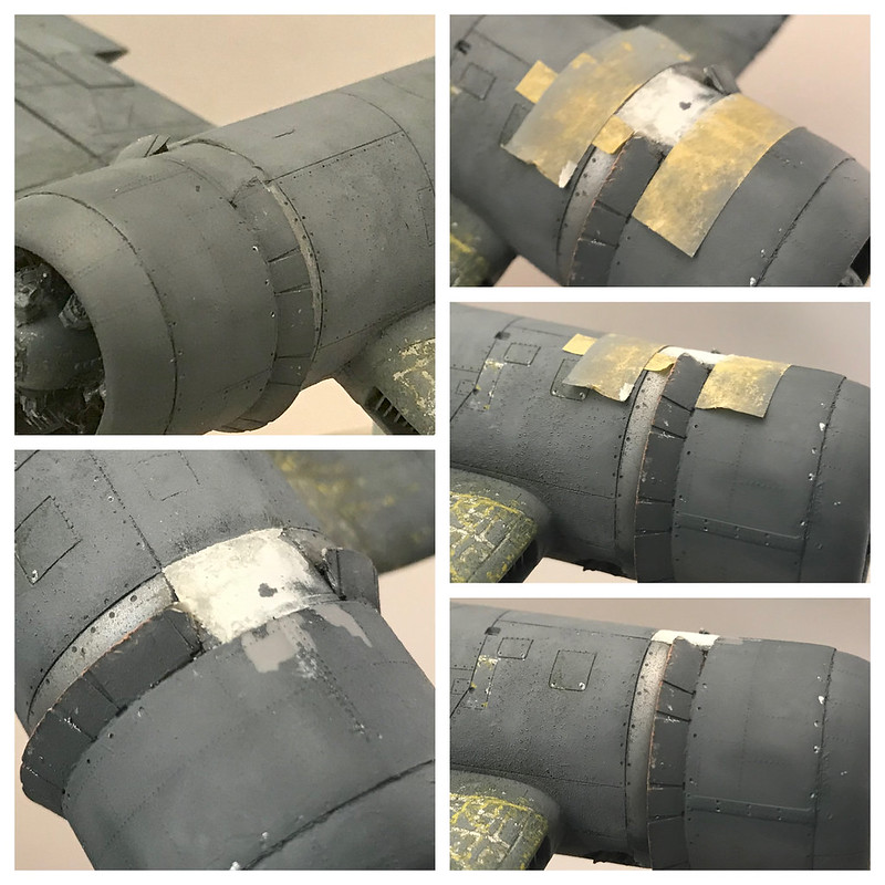
I also got around to getting the Pratt & Whitney mounted. It's epoxied in place to keep it from ever moving ever. At all. I'll leave it at that. I attached the cowl and glued it in place with Tamiya ETC. While drying I found a funny spot wouldn't settle down which left a step that I couldn't live with. I taped the boundaries off and brought out the putty to level things off. Here's that.
 Untitled by Britt Vallot, on Flickr
 Untitled by Britt Vallot, on Flickr
What's cute here is how I put the tape back on for the sake of the photo and that's of course when the tape pulled the paint off...=] ...the obstacle is the way. We've got this.
 Untitled by Britt Vallot, on Flickr
 Untitled by Britt Vallot, on Flickr
 Untitled by Britt Vallot, on Flickr
Saved.
Moving on to some additional weathering before calling this part done. I have a very specific photo of the tape that was used to seal the seams around the fuel tank within the forward fuselage in front of the cockpit. It can be seen in the photo that tape which has been removed has left a darker (more original) color paint than that of the somewhat faded paint all around it. I masked out the white parts and lightly sprayed them on a little at a time. The darker color was similarly masked out and followed up with a slightly darkened XF82.I dampened the tip of a toothpick to pick away at some of the white tape parts to show wear in places I selected which also helps to show individual strips they would have pulled for coverage.
 Untitled by Britt Vallot, on Flickr
 Untitled by Britt Vallot, on Flickr
 Untitled by Britt Vallot, on Flickr
 Untitled by Britt Vallot, on Flickr
 Untitled by Britt Vallot, on Flickr
 Untitled by Britt Vallot, on Flickr
That's where it sits for now. I'm very eager to get to the insignia and number, but I'm trying to be patient about how many to do. I've seen a few instances where both have been utilized. So if this were a newer issue Corsair, I'm wondering if they would've kept with the six position arrangement or possibly updated the wings. I'll have to make a decision some kind of way.
Hope this can be of some use. Always happy to answer questions. Comments are always appreciated. Critizism serves to make us better ;] Hit me. =]
Hope y'all are staying warm out there. Be safe.