The Quest for Color
So--part of this build requires color for the seascape. As usual... I have a vision in my mind of what I'd like to see. Imagine turquoise waters of some southern island sea. How do you give paint the depth of near crystal clear turquoise water?
Going into this, I knew that I would not get anywhere near to that, and that I'd end up with a two dimensional paint job. Trying to attain that goal was not even on my radar. However, it was in the back of my mind all through this process. That nagging pushed me to try some things, and, I ultimately stumbled on something that sort of mimics what I wanted. This is to a far lesser degree, of course. And, THAT... is OK. In my opinion, what I found is far better than the alternative that I was considering.
I'll walk you through the good, the bad, and the ugly. I warn you that you'll see some ugly testing. It's part of the process, so bear with me. To make this post easier for me, I created a key for you. Less typing for me, hopefully.
Key
SB= Sky Blue Tamiya X-14
CB= Clear Blue Tamiya X-23
FB= Flat Blue Tamiya XF-8
PB= Phthalocyanine Blue
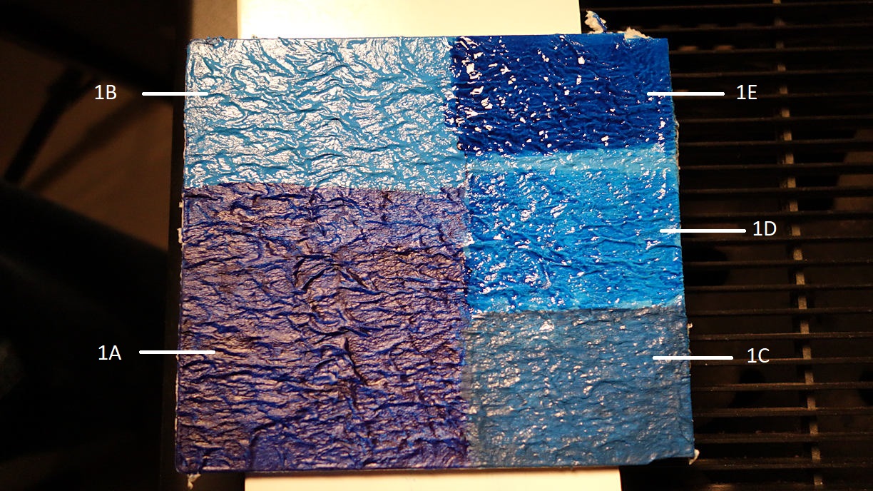
1A) PB: This was the first color that I tested. I tried this color first because of the FSM Chris Flodberg article. I like the color as it looked in his article. In the example below it would certainly need more applications. I had thinned the paint because it comes out like paste. I'll be honest here. I think this color looks like garbage. Here is the thing though. This is the wrong color. Chris used Phthalo Blue. I had a heck of a time finding that color, and I settled on this. It is marked as red version. For the time being...I scrapped this option.
1B) SB: At this point... for the heck of it... I thought about trying a lighter color. Meh...me no like.
1C): This ugliness was I think a mixture of SB and FB. AKA... puke.
1D) SB, CB: Here is where some inspiration came into play. I decided to try coating the SB with CB, and then see what happens. I thought the effect was interesting.
1E) SB, CB: If 1D was interesting, how would multiple coats of CB look? At this point my interest is tweaked. The CB is adding depth to the paint. I studied this swatch a lot. I liked it, BUT, I feel it looks a bit too garish.

What next then. Just for grins I tried the CB on my first test piece where I had used FB. I liked what I was seeing, but, I needed to test things further.
1F) FB, CB: In this case, I flowed the CB heavily, and I did not brush the coverage out. I wanted to see how the paint would settle into the wave troughs. I don't like it. It settled too much and it looks like a swamp versus an ocean.
1G) FB, CB: Here I flowed the CB heavily, but I brushed the paint out some to keep it from pooling too much. I like it. In the right light and angle...it looks like you are peering into water.
1H) SB: Here I tried to concoct my own form of CB. On one side I mixed Pledge Floor Care with FB. I did not get the same separation as with the CB does. It went on like paint. I tried a similar thing using Windsor and Newton clear Varnish. I had the same issue. I scrapped this idea. Clearly, the CB has properties I won't mimic.

So...I am going with something along the line of 1G.
More to come.