haha oh I know, and I do. My issue was I tried to mix the paint the same time every time and keep track of what colors I used. Now I just wing it every time, it actually turns out pretty similar, which is a lot to say seeing as how I rarely use paint OOB(ottle).
If you look at that paint card, you’ll see it is the three tone ACU, in his WIP he only showed the two colors (which might have been all he used on the helmet) but he definitely went back in on the BDUs and added the third darker gray.
Hope you find a mix that works! I think it really depends on what your photo ref looks like.
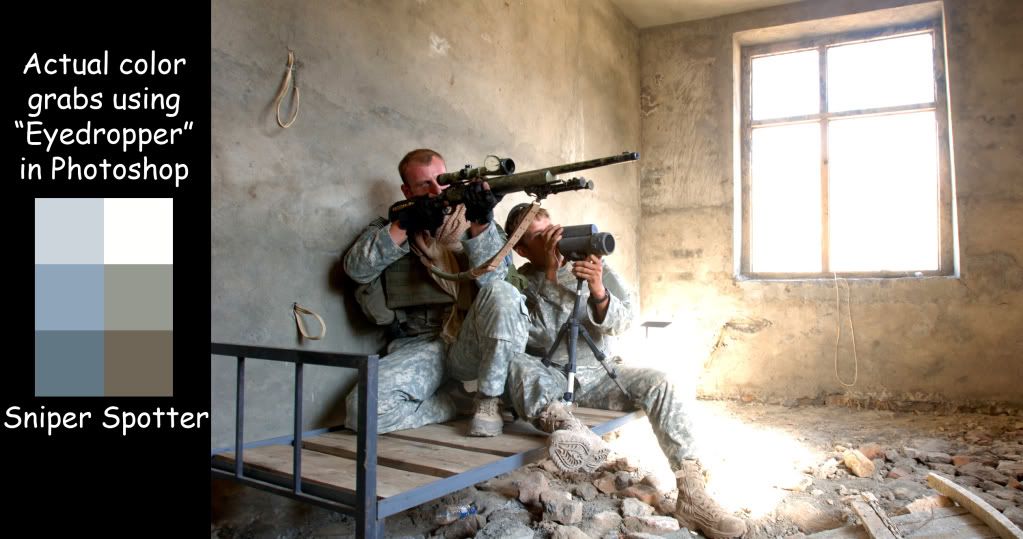
Don’t forget the camo is designed to mess with your head, the spotter looks kinda sandy gray green and the sniper looks bright Easter egg green. You can count that to lighting or folds/shading of the uniform or wear and tear or dirt or whatever... but this stuffs pretty versatile in the field from what I can tell.

And this is in the same photo, two uniforms practically touching, imagine two different cameras/weather conditions/locations/cleanliness... it goes on.
I highly recommend you find a nice shot of ACU that you like the look of online, then take it into PS, grab the average colors, and see what exactly they really are and what makes them up, anything from a gray-blue to a brownish-green by the look of it will still be accurate. Oh yeah- and a lot of grays!! Most of the spots I clicked on in neutral areas (I was just looking at the extreme examples) did come out mostly gray. So good call model!