SEARCH FINESCALE.COM

Enter keywords or a search phrase below:

Moebius Battlestar Galactica Final - Photo Heavy

5739 views
5 replies
1 rating 2 rating 3 rating 4 rating 5 rating
  • Member since
    August 2009
  • From: Central IL
Posted by SLW 45 on Monday, February 6, 2012 7:57 PM

Top notch looks ready for action to me


  • Member since
    January 2003
  • From: Washington, DC
Posted by TomZ2 on Friday, February 3, 2012 1:28 PM

All right people, this is what we do. We're the best. So let's get the old girl ready to roll and kick some Cylon ass! — Chief Tyrol  [Nice execution!]

Occasional factual, grammatical, or spelling variations are inherent to this thesis and should not be considered as defects, as they enhance the individuality and character of this document.

  • Member since
    March 2010
  • From: Democratic Peoples Republic of Illinois
Posted by Hercmech on Friday, February 3, 2012 10:26 AM

Now that is a really sweet build. Love the lighting work!


13151015

  • Member since
    October 2008
  • From: italy
Posted by bsyamato on Friday, February 3, 2012 10:17 AM

Awesome build and great effect pictures YesYesYes 

i prefere old style galactica but even this is a good ship to see Stick out tongue

  • Member since
    March 2006
Posted by TD4438 on Wednesday, February 1, 2012 8:43 AM

I'm not a big fan of the new Galactica,but this thing is just awesome!

Well done.

  • Member since
    October 2010
Moebius Battlestar Galactica Final - Photo Heavy
Posted by Warmuncher on Monday, January 30, 2012 10:58 AM

Hi all,

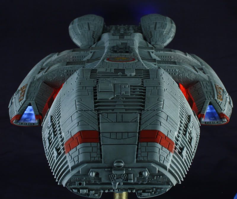
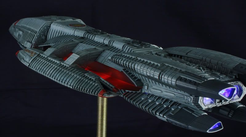
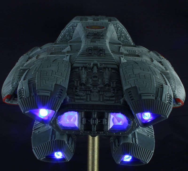
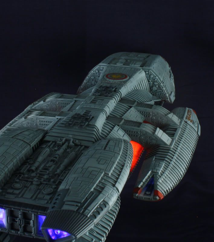
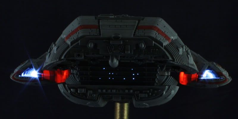
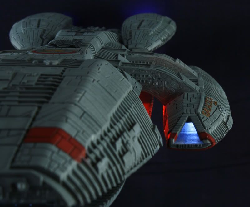
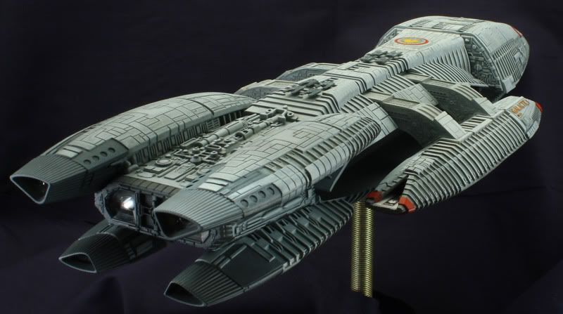
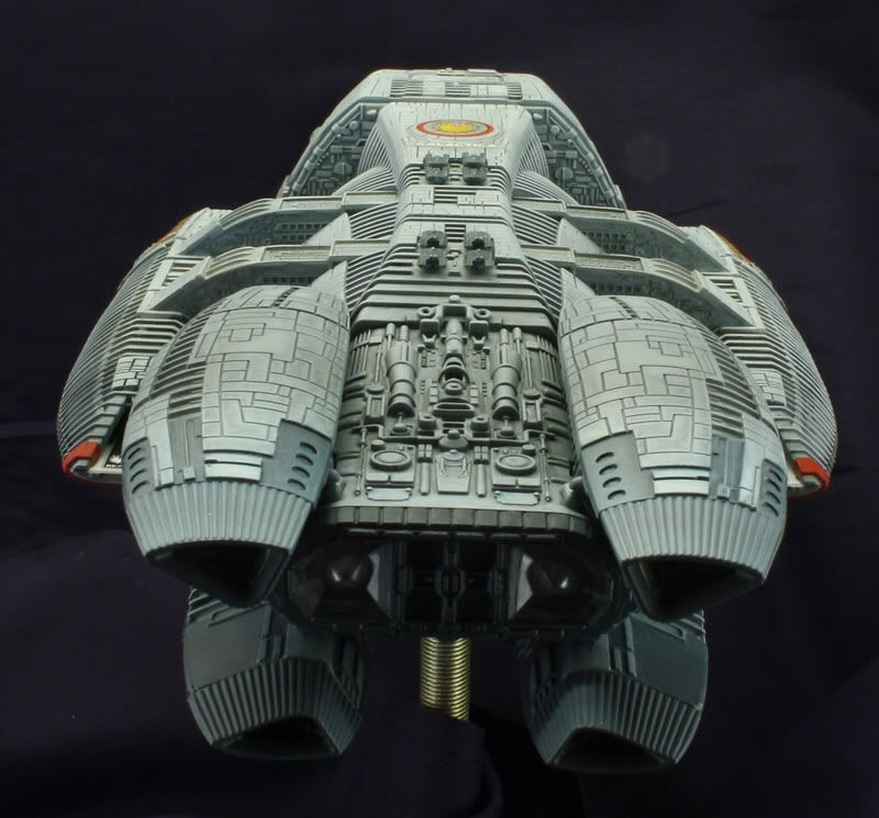
For those of you who have followed this build thank you.  I hope you all got something out of it.  I sure learned a lot doing this project that should make my next project even better.   Sorry for the long delay in posting these shots.  I don't know where my head was. 

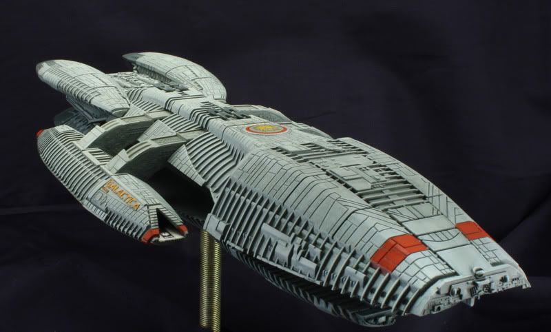
I took several photos of this project using lighting from different angles.  This model is very tempermental about the direction of the light.  I took several shots with just the side lights of my photo box on.  Even that may have been too much.  I also did a few with all of the lights on.  I think too much light washed out a lot of the weathering and even brought the lighter grays out of the paint job.  Those photos show up at the end.  And yes, I know that the antena on the nose is missing.  I can't find the part.  But when I do I'll paint it up and put it on.

I also found that I am not actually done with this model yet.  I forgot to paint the red stripes on the bottom hull.  Doh! So, I'll have to go back and paint those things.  Additionally, the stand is intentionally unpainted.  I have a larger diorama in mind that includes a few ships and lighting.  So, the stand you see is just temporary for display purposes only.  Finally, if there is an angle that you would like to see let me know.  Otherwise enjoy. :)

WiP Thread:  /forums/t/143776.aspx

 Battlestar Columbia  (First build) -

/forums/p/141851/1501274.aspx#1501274
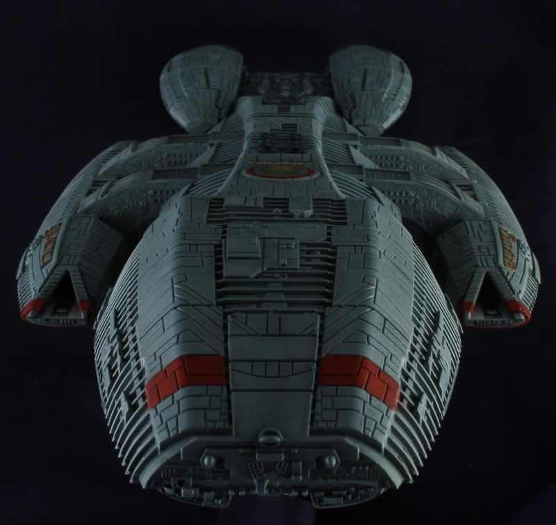


The last shot above was suppose to be a runway shot but as you can see even with a dull coat on the deck and a circular polarizer on the camera lense you just can't get away from the glare. 

All of photo box lights are on and the ship's lights are off.  What a difference in color.  The photos above are closer to the colors seen by the naked eye.


You can find me on Photobucket under Warmuncher

Proud Member of Southern Maine Scale Modelers, IPMS

JOIN OUR COMMUNITY!

Our community is FREE to join. To participate you must either login or register for an account.

SEARCH FORUMS
FREE NEWSLETTER
By signing up you may also receive reader surveys and occasional special offers. We do not sell, rent or trade our email lists. View our Privacy Policy.