CapnMac82
Here's Haven, whih what appear to be Deck Gary decks

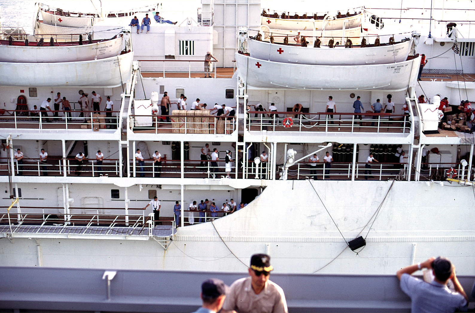
Then, this one, of Repose, seems to show the 100 and 01 Decks in Deck Gray, and the 02 and above decks in tha "wood" color. (Which, frighteningly enough, seems to resemble the Sand Yellow + Rust color recommendation by Revell--unless those aew redwod decks, maybe?)

All of these VN era photos of Repose show here without the green stripe, which is curious.
I think there's are explanations for the odd colours in these photos.
The photo of Haven seems to me to be a black-and-white photo that has been rather badly coloured by hand or perhaps with a computer. If you enlarge the photo, you can easily see that the red crosses are not even close to being "squared away":

You can even see parts of the cross that weren't covered by red, and look tan; I think this is an old photograph, "sepia-toned" by age, that someone has tried to "accurize". In addition, there is a very blotchy cross midship on the topmost deck, and an odd "Christmas tree" antenna "decorated" with red blotches that are apparently supposed to be lights.
The "green stripe," I'm thinking, is actually an age-toned dark grey stripe. I don't think it was painted like the "red" crosses — the stripes' edges are perfectly straight and parallel. (During the Vietnam War, Repose didn't have any stripes on the hull, red or green. Other Repose photos, from the 1950s show only the crosses, too.)
Before the advent of inexpensive, accurate colour printing, there were professional artists who used watercolours and oils to colorize black-and-white photos. This photo of the Haven wasn't coloured by a professional!
Now about that Repose photo: There are no obvious, distinct shadows, so the day was probably lightly overcast, which is excellent for photographing high-contrast subjects. The upper decks are well lighted by the sky, whereas the lower decks are lightly shadowed by the overheads and therefore appear darker than the upper decks.
I'm sticking with the "theory" that Repose's decks were wooden.
Bob
P.S. I've now seen a similar image of Repose similar to the one at the top of this post. I'm now convinced that some postcard company hand-painted a black-and-white photograph of Repose so they could publish "color" postcards. That technique is not at all uncommon, although it's usually done with more finesse.