First let me say this model is very well done! I think the weathering and the dot meathod really worked out well for you!
I noticed this though and thought I’d try and touch on that with my own methods (not that I always manage to execute them correctly...
![Whistling [:-^]](/emoticons/icon_smile_whistling.gif)
)
 Lufttiger wrote: Lufttiger wrote: |
The blood is just stright out of the tube oil, i should have added just a little black, but it turned out ok. Thanks.
|
|
When I mix blood colors, I usually don't go for black right off- the straight red looks too red, but I tend to add various amounts of purple and brown until it looks the way I want, as blood tends to dry more of a brownish/rusty red. Even if it's very fresh, although I might make highlighted areas more reddish, I still add a small bit of purple/blue to get it to look more... gritty I suppose is the best word I can think of. Otherwise I feel it just jumps out too much. Personally I feel blood is better when it's subtle, not because I think it has to be done “tastefully” per say... (war being what it is) but mainly because I feel like its more of a realism factor and even more effective/powerful when it's not the first thing one sees.

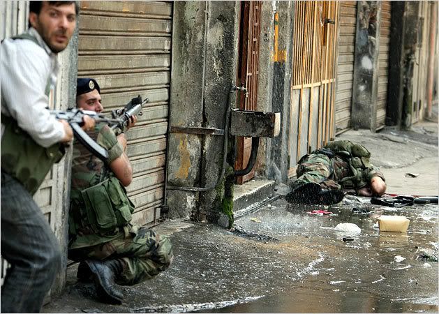
This is a picture off of a cover of an older NY Times that I saved because it was chilled me in a way. Not only because it showed a dead soldier, but because of the soldier that is still alive- yards away and appears all alone. There's the slightest hint of blood, but I feel like the drama of the scene would have been more gore than a real story had it been the first thing I saw. What really makes this picture present it self as how I would want to model a dramatic firefight in 1/35 scale is the way the uniformed soldier is looking back towards the camera and like previously mention, one of your figures looking off “screen” if you will, is a very cool touch.
Sorry that my
![My 2 cents [2c]](/emoticons/icon_smile_2cents.gif)
turned into more of an essay, I tend to do that... I’ll try and work on it so its not
![Zzz [zzz]](/emoticons/icon_smile_zzz.gif)
Looking forward to your next build! This one was excellent and I’m sure you’ll only improve from this point on!