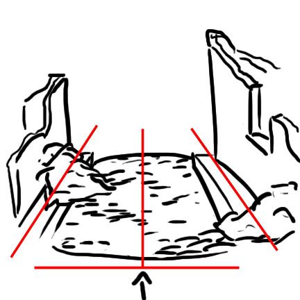
I agree with vespa, when I heard you were going to put up a secondary wall across the street, this is what I had in mind as far as your composition went.

The arrow being where the viewer would look down the dio, even though the roads and buildings are at 90 degree angles, you still get a more realistic view, pulling the viewer in with the perspective shot. Again, what vespa says about knowing your composition and balance comes into play.
Think back again to the photo class. Even though the rule of 3rds and keeping nice photographs balanced by positioning your subject is the basic way of doing things, one can put the subject dead center, but still have the rule of 3rds apply by using color and focus to pull the interest a little off center, balancing the over all photo.
So for an example, if you’re going to have 90 degree road/base- make sure you balance the buildings and figures so it doesn’t look too symmetrical. One or two figures on the left, three or five figures on the right, one building tall, one short, lots of rubble on one side, a clearer road on the other- and don’t forget color and texture, a red brick building and a tan stucco structure on the other side, maybe a lamppost on one corner etc.
Basic lesson, there’s more than one method out there to achieve interest and pull a viewer in with a triangular display. An easy way is to angle the roads/buildings, but as vespa points out, this is overused and taken as a rule more than a concept. You can still make a triangular composition of interest and use a 90 degree road/building/base set up, it’s just going to take a little bit more thinking outside the box. I think you can pull it off if you keep using this WIP to get advice and feedback from the pros like vespa, the doog, HvH and the others on here. Good luck!