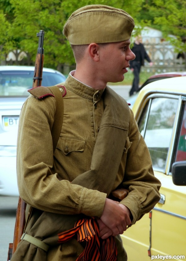
Looks pretty close to me, but yes khaki is the way to go. There are various shades of khaki, google the colour and one will find quite a variety. Is Vallejo the best one - no, not if you want the yellow spectrum of khaki. I wouldn't hold the box art, nor to a lesser degree, printed art work as the definite shade either - the printing process can give a lot of leeway as to what the client expects as a finished product.


On my comp the bandolier looks pretty close to the uniform colour you have. If you prefer, maybe a light wash of yellow ochre will give you the shade you want.
http://rkka.ru/uniform/files/i_arm.htm
As for a flat look, I suppose some paints are better than others, but I find hand brushing along with washes will eventually bring a slight sheen to the figure, not to mention the mere handling of it with your fingertips. What I do is a final layer of clear flat sprayed onto the figure.
regards,
Jack