The Final Chapter--Part 1
I had mentioned having a problem that you won't believe. And let me tell you, I still can't believe it. Basically--the problem started when I sprayed the water color. It came out splotchy. I determined that this will not do--so I decided to strip the paint with IPA and start over. I used IPA because it was a light coat of paint and I knew IPA would make quick work of removing it. And--it did. What I didn't expect is what I found after removing the masking. The image below speaks for itself.

Wow! I suspect IPA leached into the joins and somehow--chemically--it caused stress fractures. I NEVER would have seen that one coming. Thanks a bunch--Gremlins. You got me on that one.
There is NO WAY I am buying another case. This submerged dio idea is not all that genius that I should double down and do it again. Replacing it would be expensive too. As Dana Carvey would say in his best Bush voice,"It wouldn't be prudent."
Nope. It is time to dumb down this project. But guess what? Doing so lead me to a result that I like even more. And there it is, there is the silver lining.
Out goes the soak, in comes the plunge
I purchased an acrylic base to create an inflight Icarus. (Only $8.00 and I wish I ended up here sooner). Truly, this was a work in process, and how I got to the end was quite the journey. Here is how it all developed:
As mentioned in a previous post I am designing a detachable power supply. SO, a connector is needed. I started by cutting a notch for the connector to nest in. Doing it this way provides the clearance I need and at the same time, it will provide a stronger mechanical hold. There will be stresses with plugging and unplugging and I don't want it popping off.
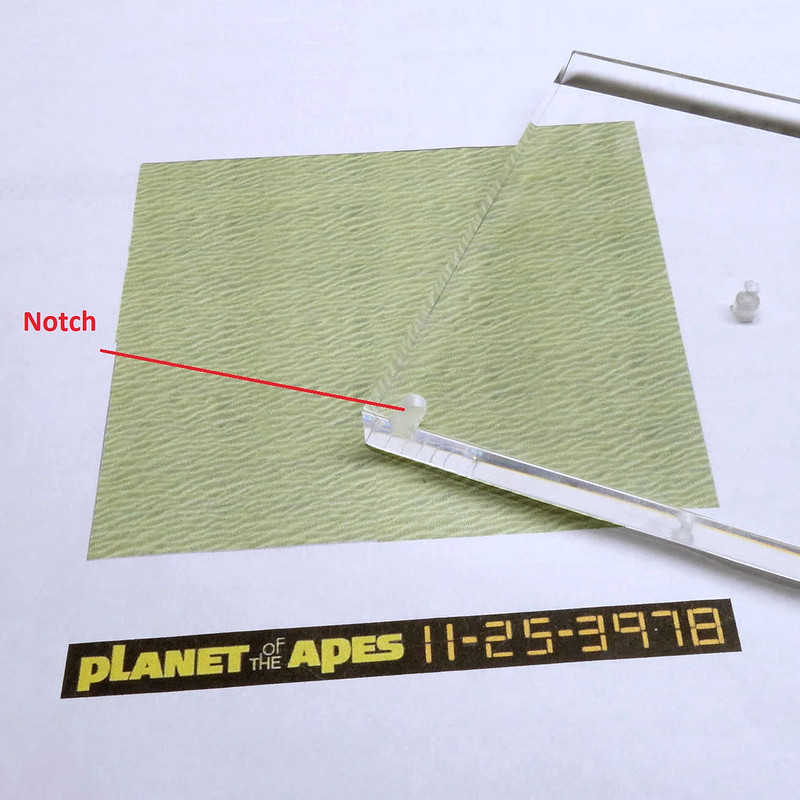
A case for testing
This acrylic is thicker than the enclosure and the water effect that worked well in that instance might not work well here. So--I did a test piece where I broke it out into thirds. The left has paint on top, the middle has paint below, and the right has no paint at all. The latter would use colored paper mounted from below.
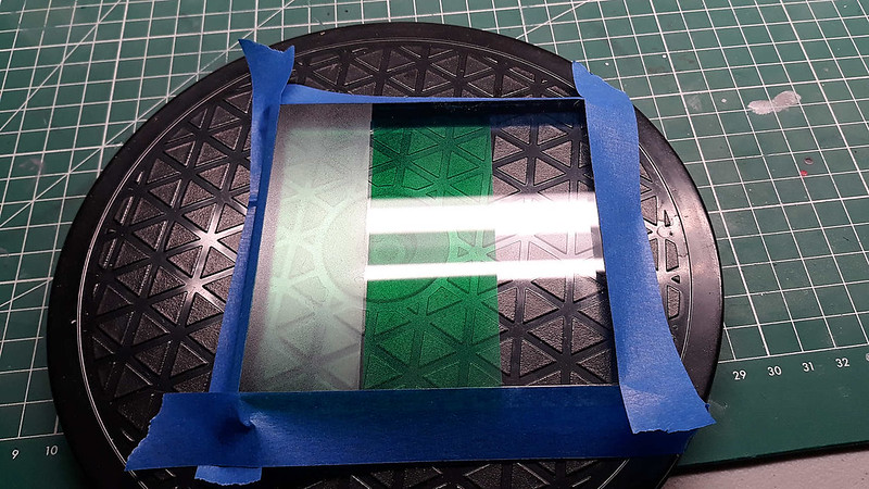
My initial thought is that the left section looked terrible, the middle section looks good with great contrast, and the right has its merits too. I thought for sure the middle section would win but...
not so fast. After applying the AK water gel, the section on the left looked the best to me. I never would have thought it. That horrid flat finish magically disappears and instead you get good contrast, depth, color tone, and clarity. The section in the middle didn't change much, maybe now having a slightly richer appearance. The right section looks nice, but the color doesn't translate much via the paper. What you DO get is the appearance of CRYSTAL-CLEAR water. I did like it though. It is like water you'd find on some remote island, or on some distant unspoiled planet. But--I set out on this journey to have green water and that leaves the other two. In the end--I feel the middle section appears as too green and there is something about the water characteristics that strikes me as not correct. That leaves the left section, and that is what I went with.
Test piece below is with AK applied and a graphic that I talk about later.
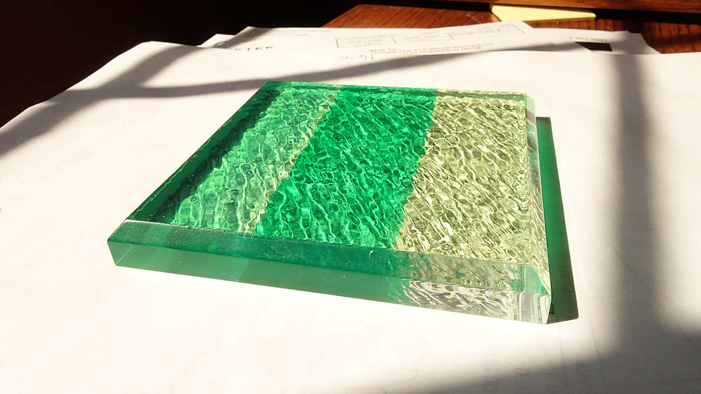
The graphic
As you know I made my own graphic. The dilemma is in how to apply it. My first inclination was to make it into a decal. Considering all the decal issues, homemade or purchased, I was not a fan of this option. In short--it has the most potential pitfalls and at this point, I am in no mood for more setbacks.
I then explore printing the graphic on photo paper and mounting it via double sided tape. While chewing on that option--it occurred to me that maybe I could make a plate out of styrene, thus giving it more formal look. The graphic then applied using either paper or decal. I was about to settle on trying this when there was a happy accident:
By happenstance, the graphic ended up under the acrylic base and while I was moving around in my chair, I notice something flash. I thought, "What was that? Did I imagine that?" I bend towards the base for a closer look and holy ape--like magic--the graphic pops on. The front of the base has a bevel and by quirk of diffraction the image appears or disappears depending on your position to it. The beauty of it is it does so in an almost magical way. It acts like if it were an LCD. It goes from a complete off state to complete on state, or vice versa, and it does so with clarity and with minimal distortion.
I was stunned that this presented itself. With a little more experimentation, heck yeah, this is the way to go. Also--when I view from the sides the graphic appears as if it's submerged within the water. This adds yet another dimension to it. So, not only does it look and function cool as all heck, but it also vastly simplifies the job. All that I need to do is mount the graphic below deck. There is no need to pretty it up--no need to make a decal--just no need. And in the end it looks lightyears better than something I would have printed and applied to the outer bevel.
Seafloor by the seashore
I thought it might work well to graphic ripples and use them as the basis for the sea floor. So, I captured an image off the net and with the magic of photoshopping, I scaled and stitched together swatches to the size I need. And I was right. The graphic plays really well against the AK gel ripples and they look best when aligned a right angle to each other. The combination helps create an illusion of depth and it promotes the feel of actual water. I tinted the graphic light green because in testing I found it brought balance to the overall water effect. This then is the basis for the seafloor.
As a side note: I tested images of rocks formations and such, but they did not translate well because of how their shadows play. Using sand ripples makes the piece pop.
Below is the actual base, freshly painted.

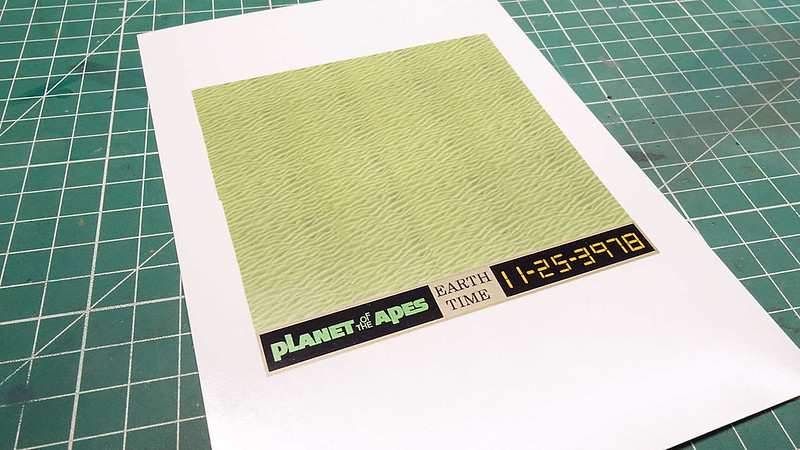
Below is the final graphic. I combined both the bevel graphic with the ripple graphic onto one print. This made applying the graphic easy, all in one piece. I printed the graphic on photo paper at highest quality. The actual photo has more color and it looks better than this image.
This then must be trimmed for install.
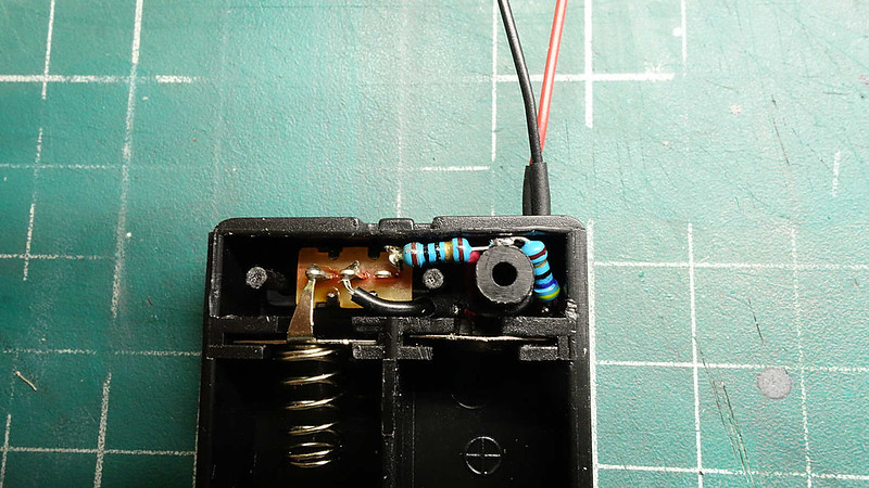
If I had 20/20 vision of how this dio will end, I would have done some things different. For instance, the current limiting resisters for the LED. Had I known what I know now--I would have tried burying the resistors within the ship behind the firewall. Also--I would have moved the wire port to where the stand connects.
Anyhow--I was left with a little dilemma. I don't want them hanging below the base, and I certainly didn't want to cut another nest into the acrylic. They would be seen from above. I could mount them in-line with the wiring from the battery pack but that won't look very nice either. Fortunately--I was able to cram them into the battery pack where they won't be seen.
There are other things I had to make compromises on but overall--it is within my tolerance of good to go.
Thus ends, The Final Chapter--Part One. It is a long read--for a long WIP. Why change now?
Icarus is completely done. More time is needed to image it and then I will post the final part.
Ape on Dudes.